

Recent Comments
Mr WordPress on Hello world!


The 2 Point Perspective assignment was new to me. I have drawn buildings before, but nothing to this extent. Drawing the Brophy Chapel was challenging. It was difficult mainly because there were two vanishing points and those points were not located on the actual paper. Also, the vanishing points were nearly straight, so the slope was very slight. After figuring out the vanishing points and placing tape to indicate where they were, Mr. Nelson helped us measure each significant section of the chapel. This was very helpful to me because when I actually started drawing, I only had to worry about the widths. After drawing the basic shape of the chapel, I needed to add details. The chapel is very detailed so this was probably the hardest thing about the drawing. I had to make sure everything was measured correctly and that the small pillars on the top were identical. Adding details took days, but finally I was ready to add shadows. There were shadows everywhere around the chapel, but since I worked on it during different times of the day, the shadows moved and I had to remember where they were when I first started. All in all, I think I did pretty well on this. It turned out better than I expected.


Post 1
Artist: Van Gogh
Title: Langlois Bridge with Women Washing
Dimension: 780×600
Media of Work: Oil Painting Tile
Why I chose it: Van Gogh is a renowned artist.
Some interesting factoid about the artist: Van Gogh cut off his ear because he was depressed.
What about the reference image can you integrate: He drew his objects according to his vanishing point.
Post 2
Artist: Stefanimak
Title: Boardwalk Perspective
Dimensions: 432 x 325
Media of Work: Colored Pencil
Why I chose it: I liked his color choices.
What about the reference image can you integrate: He used color, which is unusual for this type of art.
Some interesting factoid about the artist: He was a seventh grade teacher.
Post 3
Artist: Paul Heaston
Title: Orange Juilus
Dimension: 12 x 8”
Media of Work: Graphite on paper
Why I chose it: I like this drink place and I thought it was interesting how he picked a restaurant.
What about the reference image can you integrate: He made lines going in different directions to get more effect.
Some interesting factoid about the artist: He lives in Texas and lived in Montana.

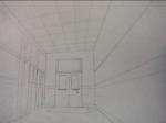
This assignment was somewhat difficult for me. We had to draw the halls of Brophy Halls. The Golden Nuggets that Mr. Nelson taught us were very important. I think one of the most important things for this assignment was to make sure that all lines that were perpendicular was aligned to the eye level point, and that all the lines parallel stayed as is. On the first day, I got the basic lines of the classroom. On the second day, I started to draw the doors. I had trouble with this because the doors at the very end were so small and I had trouble measuring it. As it got closer to me, it became easier because it was easier to measure. On the third day, I was absent, so I had to make sure I got caught up with the class. When I was almost done, I had to shade. During this part, I had to make sure that it was darker when it was further away, and lighter as it got closer, because this is how it was in real life. To my surprise, my drawing turned out way better than I expected.


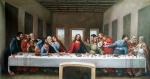
When we first got the picture to draw, I was pretty nervous. However, I was relieved to hear that we would be doing it box by box. We first drew a grid. I decided to use the same dimensions as the actual picture so it was simpler. Then, I drew the actual picture over it with pencil. After drawing it with pencil, we were told to use the ink tool. I had trouble using the ink tool at first, but I eventually got the hang of it. I was relunctant to use it because after applying it to the paper, you can’t delete it. Unfortunately, after two days of doing this assignment, I got an appendicitis and was unable to finish it. I am planning on finishing it at break or lunch. By the looks of what I had already done, it was pretty good. After finishing it, I think it will look even better. To my surprise, this assignment was way easier than I had expected.
Post 1
Artist: Leonardo DaVinci
Title: The Last Supper
Dimension: 15” by 28”
Media of each work: Painting
Why you chose it: I grew up knowing about this painting because of my religion.
What about the reference image you can integrate: How he kept all the details and maintained the perspective and scale.
Some interesting factoid about the artist(s). He was also a musician.
Post 2
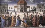
Artist: Pietro Perguino
Title: Christ Handing the Keys to St. Peter
Dimension: 335 x 150 cm
Media of each work: Oil Painting
Why you chose it: I thought that the setting was very interesting.
What about the reference image you can integrate: He made the people in the back smaller so it actually looked like you were there.
Some interesting factoid about the artist(s). He was also a musician.
Post 3
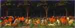
Artist: Paulo Uccello
Title: Hunting in the Forest
Dimension: 20 x 24 cm
Media of each work: Oil Painting
Why you chose it: I liked how he chose basic colors and still made it very unique.
What about the reference image you can integrate: You can see the trees get smaller and darker as it goes back.
Some interesting factoid about the artist(s). He was also a mathematican which can explain why he was so good at this kind of work.

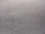


When we were first introduced to this assignment, I was nervous. I kept thinking how hard it would be to get the exact shapes and colors drawn into our sketchbooks. After looking at four different angles, I picked one that included the terracotta pot, corns, cup, vase, and candleholder. I chose this angle because it included most of the objects and it looked the best compared to the rest. During the first day, our aim was to get the basic shapes of the objects. I used a light pencil in case I messed up. For the second day, I drew more objects. During the third day, I added basic shadows, and during the third, I added details and outlines with a harder pencil.
Surprisingly, this assignment was quite simple for me. Although I was anxious at first, I got a hold of it once I began drawing. Mr. Nelson taught us to use our fingers to focus on the objects we were drawing. This really helped me out because I focused on the objects one by one instead of the whole picture. In the end, the objects went together like a puzzle and made a great still life.
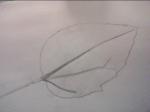


I learned so much during my leaf study drawing. When I first learned that we were doing a leaf drawing, I was excited. I thought it was going to be very simple, but I was wrong. There were so many important techniques I had to keep in mind when drawing my leaf. Mr. Nelson taught me it was imperative to include shadows and making the leaf really pop out so it looks real. During the first day, Mr. Nelson showed us how to get the basic shape of the leaf. He told us that it was better to do this, instead of trying to perfect it from the start, like I usually did. When you do that, the ends don’t usually match, so you have to redo it many times. After getting the overall shape, we could then outline it harder. We also worked on drawing the veins during the first day.
On the second day, I worked on creating more details on the leaf, and adding drop shadows. I had trouble doing this because my leaf was really flat, so I didn’t know where to draw the drop shadows. I then asked Mr. Nelson and he showed me how to do it. The hard paper, which was shaped like a pencil, really helped me merge the lines and make them look like shadows, instead of definite lines.
On the third day, I was shocked because the leaf dried up. The leaf looked different, so I had a hard time completing the unfinished details. I had to do my best imagining how my leaf looked prior to this. The third day was mostly for adding more details, and erasing small mistakes. I had to do my best to perfect my leaf and try to make it look as good as possible. Knowing that I have little background in art, I think that my drawing looked great overall. Yes, it’s not the best there is, but it’s the best I can do at this point.


Post 1
Artist: Picasso
Title: Still Life Under a Lamp
Dimension: 53.1×63 cm
Media of each work: Linoleum cut
Why you chose it: This artwork interested me very much because of the unique choice of colors.
What about the reference image you can integrate: The artwork seems very abstract to me. It shows Picasso’s skill.
Some interesting factoid about the artist(s). His favorite animal was a bull.
Post 2
Artist: Paul Morgan
Title: Still Life
Dimension: 16 x 12 inches
Media of each work: Oil on Canvas
Why you chose it: The fruits on the picture looked so real to me, as if I could actually grab it from the painting.
What about the reference image you can integrate: I like the colors he chose, and the realness of the figures.
Some interesting factoid about the artist(s). Paul Morgan was an English engineer.
Post 3
Artist: Hans Memling
Title: Vase mit Blumen
Dimension: 28,5 × 21,5 cm
Media of each work: Oil on Wood
Why you chose it: The designs on the blanket caught my eye.
What about the reference image you can integrate: I really like Hemling’s distinct patterns on the vase and blanket. I also like his simplistic choice of colors.
Some interesting factoid about the artist(s). Said to have been wonded at the Battle of Nancy.
| Mr WordPress on Hello world! |
